Logoai

Logo design guide

How to use AI for a logo that fits your brand

The useful question is not simply how to use AI for a logo; it is whether you need a new concept or a better version of a mark you already have. Choose a path, give the tool a focused brief, then judge the result outside the preview.

Free to start · no signup
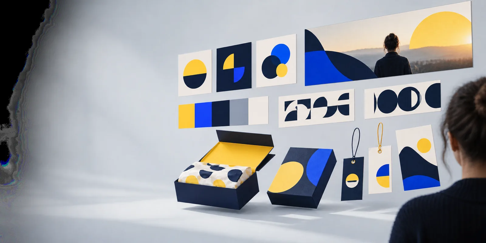
Logoai visual showing a brand identity concept

decide which case you are (decision table)

Treat these three situations as a decision table: match your starting material to a path before writing a prompt. That choice determines what you ask AI to change—and what it must preserve.

No logo yet: choose Path A

You have a name and an idea of your audience, but no mark to protect. Ask for distinct directions rather than one polished answer: for example, a wordmark, an initial-based symbol and a type-led lockup. Compare the directions before refining details.

Existing mark: choose Path B

You already have a logo, sketch or established visual identity. Identify the defect first—poor legibility, excessive detail or an awkward layout—and ask for revisions that retain recognizable elements. Keep the original nearby for comparison.

Important public use: add a review

If the mark will appear on signage, packaging or registered business materials, follow either path with a more careful review. An appealing image is not proof that the design is original, legally available or suitable for every production method.
path A

For a new brand, begin with a brief short enough to stay consistent across several attempts. These inputs matter more than a long list of fashionable styles.

Required

Write the exact brand name and check its spelling before generating concepts.

Generated lettering may still need manual correction.

Required

Name the audience and one quality the brand should communicate, such as calm, playful or dependable.

A specific audience is more useful than asking for a universally appealing logo.

Required

State the main use: website header, social avatar, shop sign or product label.

The intended use affects how much detail the mark can carry.

Optional

Choose one or two constraints, such as a single color or no pictorial icon.

Constraints make alternatives easier to compare.

Optional

Collect a few references for the mood you want without requesting a copy of another brand.

Describe the qualities you like rather than naming a logo to imitate.

path B

If you already have a mark, use AI to explore controlled revisions rather than to replace its identity. The dated milestones below explain why that distinction matters.

  1. Keep the source mark

    Traditional logo revisions began with an existing drawing or editable file. That remains the reference for Path B: save the original, note which elements people recognize, and decide what problem a revision must fix.

  2. Explore visual alternatives

    As prompt-driven image generation became widely visible, it became easier to explore styles quickly. Use that speed for comparisons, not as a reason to accept a changed brand name, unfamiliar symbol or inconsistent lettering.

  3. Narrow the revision brief

    A useful revision request names both the change and the boundary: simplify the icon for small screens while keeping its silhouette, for instance. Compare each result with the source mark, not just with other generated options.

  4. Finish the design deliberately

    Select a direction, then inspect spacing, letterforms and proportions with a human eye. If the result is only an image, determine whether it can be recreated cleanly for the places your brand needs it.

final check

A logo AI concept can look convincing at presentation size and still fail in everyday use. Give the strongest candidates the same practical tests before selecting one.

  1. Test recognition before decoration

    Shrink each candidate to the size of a social profile image and place it beside a plain-text version of the brand name. Ask someone unfamiliar with the project what they can read and remember. Remove detail that disappears, and check whether the symbol still has a clear shape without its presentation background.

  2. Check color and production

    View the mark in black and white, on light and dark backgrounds, and on a surface similar to its intended use. Gradients and fine lines may look attractive on screen but be difficult to reproduce on a stamp, embroidered item or small label. Keep a simpler direction available if those uses matter.

  3. Review similarity and rights

    Search for similar marks in your field and location, and read the terms that apply to the tool and any supplied assets. AI output alone does not establish exclusivity or trademark availability. For a high-stakes launch, consider a qualified design or legal review before adopting the mark publicly.

Turn your brief into a direction

Start with a brand name, audience and intended use. Explore a few contrasting concepts, then bring the strongest option back to the legibility, production and similarity checks above.

  • Start from a focused brief
  • Compare distinct directions
  • Review before public use

tutorial FAQ

Begin with your brand name, audience and where the logo will appear. Request a few clearly different directions, then compare them for readability and fit rather than trying to judge artistic quality alone. Use the strongest direction as a starting concept, not an automatic final design.

Include the exact name, what the organization does, the impression it should make and one or two visual constraints. For example, specify a one-color wordmark for a neighborhood repair shop instead of asking for a modern logo. Avoid conflicting instructions or a request to copy a recognizable brand.

Yes, you can use it to explore revisions if you can clearly describe what must stay and what should change. Save the source mark and compare each proposal against it. Inspect names and lettering carefully, because a visually plausible revision can alter important details.

Compare candidates at the sizes and on the backgrounds you expect to use. Check whether the name reads correctly, the shape remains recognizable and the design works without effects that may not reproduce well. Then review potential similarity to marks already used in your field.

Not necessarily. It may need corrected lettering, cleaner geometry or a version suited to your intended applications. Check the applicable tool and asset terms, and seek appropriate professional advice if ownership or trademark protection is important.

Make a logo
Make a logo