Logoai

Start with intent

AI logo prompts ideas that give your brand direction

AI logo prompts ideas are most useful when they describe a business, an audience and a visual constraint—not just a style. A vague request may produce an attractive symbol that could belong to anyone. Start with a specific brief, then judge the result at the sizes and in the places where your logo will appear.

Free to start · no signup
Logoai landing-page visual showing an AI image concept

3 concrete workflows

Choose the workflow that matches the decision you need to make. Each begins with a brief you can revise after seeing the first result.

Neighborhood shop owner

You need a welcoming mark that stays recognizable on a sign and a small social profile. Name the type of shop, ask for one simple visual motif, and request a version without lettering.

Compare the symbol at large and small sizes. Keep the version whose shape remains clear without relying on fine details. For a broader range of directions to assess, see best logo ai examples.

best logo ai examples

Independent consultant

You want a restrained identity rather than a decorative illustration. Specify your field, the impression you want to make, a limited color palette and a simple geometric form.

Review whether the result feels credible on a presentation cover and in a single color. An ai logo generator with prompt approach helps you change one instruction at a time.

ai logo generator with prompt

Event organizer

Your event name must be readable on posters and mobile screens. Develop the symbol and lettering separately so you can assess each without the other hiding a weakness.

Choose a mark with room for clearly typeset event text. If the name is the central feature, an ai text logo generator is a more relevant direction to investigate.

ai text logo generator
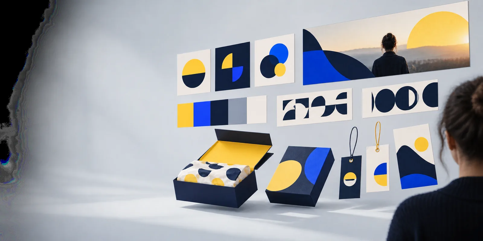
Example output

These are sample briefs and the results to look for—not claims about an existing image. Use the descriptions as criteria when reviewing a generated concept.

1

A plant shop needs a friendly symbol for a storefront and profile image.

Try: Create a simple leaf-and-window logo concept for a neighborhood plant shop; warm green, no lettering, clear at small sizes.

Look for a compact outline where the leaf and window read as one idea. Reject versions with thin veins or tiny panes that disappear in a profile image.

2

A research consultant needs a calm mark for slides and documents.

Try: Design a restrained geometric logo concept for an independent research consultant; one connected shape, deep blue, no gradients or lettering.

Look for a silhouette that still works in black. If the shape resembles an unrelated industry or a familiar corporate mark, revise the motif rather than adding decoration.

3

A community arts event needs an energetic identity.

Try: Create a bold abstract ribbon logo concept for a community arts festival; two contrasting colors, open space for a separately typeset event name.

Look for movement without visual clutter. Test whether the symbol remains distinct beside the event name on both a wide poster and a narrow mobile layout.

Compliance notes

Treat the first result as a concept, not a cleared identity

Before publishing a logo, check the generation tool's current terms for commercial use and confirm what rights, if any, they grant. Search for confusingly similar marks in the places where you plan to operate, including relevant trademark databases; a prompt cannot establish that a design is original or available. Inspect lettering carefully, since image-generated text may be misspelled or inconsistent. Save your brief and revisions, and have a designer or qualified adviser review a mark when the business stakes warrant it.

  • Check usage terms before publication
  • Review similar marks in your market
  • Test legibility in real placements

Scenario FAQ

Name the business or event, its audience, the impression the mark should make, and one or two visual constraints. State where you will use it, such as a storefront sign or small profile image. Leave room for interpretation instead of listing many competing symbols and styles.

Replace broad words such as modern with details specific to the organization and its customers. Ask for a distinctive visual relationship, such as a leaf integrated into a window, rather than a collection of familiar icons. Compare several directions and revise the strongest one.

Include the name if you want to explore how it might sit alongside a symbol, but check every letter in the result. You can also request a symbol without lettering and add carefully typeset text later. This separates evaluation of the mark from evaluation of the typography.

A long list of conflicting styles makes the result harder to evaluate. Start with one clear direction, then test alternatives in separate prompts while keeping the business brief the same. That way, you can tell whether a change in style actually improves the mark.

Check whether it fits the brand, reads at small sizes, works without color and remains clear beside the business name. Compare it with marks already used in your market before adopting it. A polished image alone does not establish usability or legal availability.

Make a logo
Make a logo