Logoai

Visual inspiration

How to judge the best logo ai examples

The best logo ai examples do more than look striking on a screen. Use these visual references to decide whether a concept suits its audience, stays recognizable at small sizes, and gives you a useful direction for further design work.

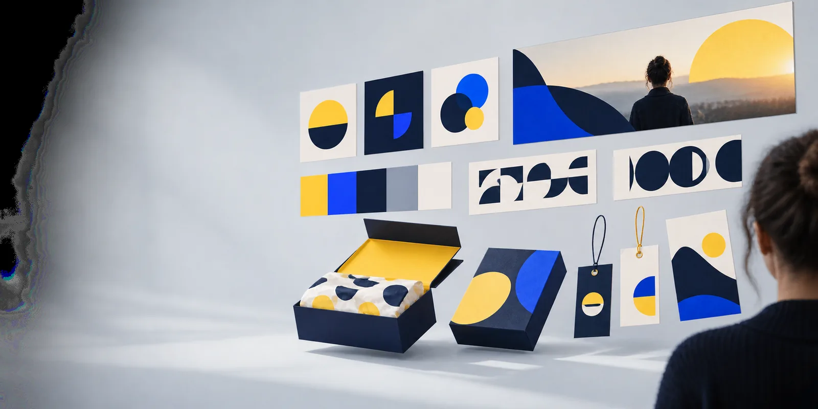
Logoai landing-page visual introducing logo design concepts

What this scenario must deliver

A useful example connects a recognizable mark to a specific job. Start with the audience and where the logo will appear, rather than judging the image in isolation.

New business owner

You need a direction that can appear on a website, a social profile, and a simple printed card. Compare concepts for clarity before choosing a favorite style.

Keep a shortlist of marks whose shapes remain distinct without a decorative background. Check the business name separately: attractive lettering in an image is not proof that its spelling or spacing is ready to use. The ai company logo guide explains how to evaluate a mark for everyday business settings.

ai company logo

Founder naming a product

Your product name needs to carry more of the identity than an icon. Look for examples where the wordmark and symbol could each work alone.

Compare letterforms at small sizes and inspect every character for errors. A compelling symbol cannot rescue an unreadable name. The ai text logo generator guide focuses on the particular problems that arise when lettering is part of an AI-produced concept.

ai text logo generator

Designer exploring directions

You want several clearly different starting points for one brief, not minor color changes to the same shape.

Write down what changes between concepts: geometry, typography, visual metaphor, and intended audience. Keep the strongest idea from each direction, then develop those ideas deliberately. The ai logo prompts ideas page offers ways to vary a brief without losing its core requirements.

ai logo prompts ideas

Local service provider

Your logo must feel credible on a vehicle, workwear, or a small directory listing, where fine detail and subtle gradients may disappear.

Favor a bold silhouette and a restrained palette. Imagine the mark reproduced in one color before relying on effects that only work in a large image. If the service category is not obvious, the name and surrounding brand copy must do that work.

how to use ai for a logo
Each item: four visual references

These are site example images, not documented case studies. Their original inputs are unavailable, so the captions give you a concrete question to apply rather than inventing a production prompt.

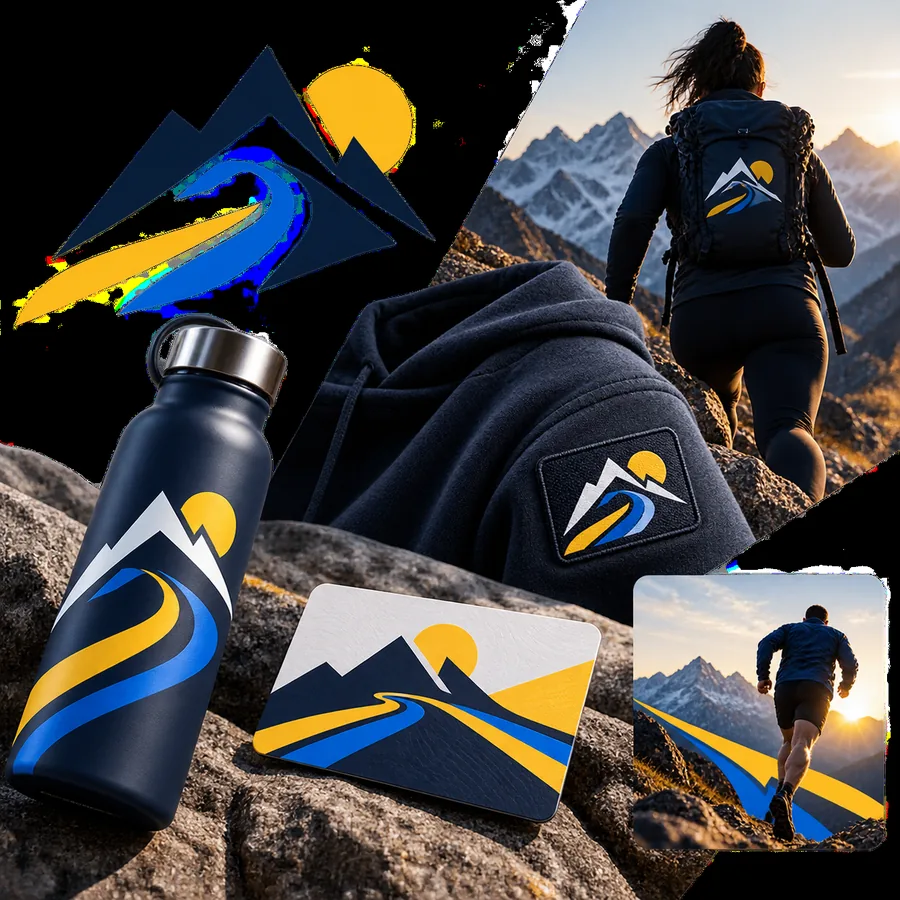
  • Logoai example image 01, shown as a visual reference Recognition
    Original input not documented. Start with recognition: cover any surrounding presentation and ask whether the central shape would still be identifiable as a tiny profile image.
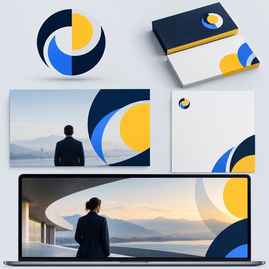
  • Logoai example image 02, shown as a visual reference Lettering
    Original input not documented. Examine the lettering character by character, then decide whether the name would remain readable without the accompanying symbol or large display treatment.
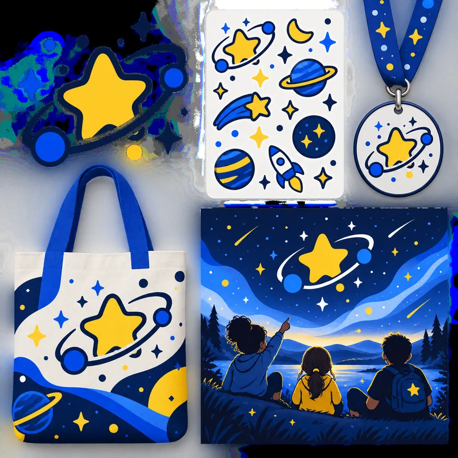
  • Logoai example image 03, shown as a visual reference Color
    Original input not documented. Consider how much of the concept depends on color. A promising direction should retain its basic identity when viewed in grayscale.
  • Logoai example image 04, shown as a visual reference Simplification
    Original input not documented. Identify details you would remove before using the mark on a small label, a favicon, or a single-color print application.

Quality bar: choose the right direction

Judge concepts against the job they need to perform. A polished presentation is useful inspiration, but it is not a substitute for a usable mark.

1

When the logo will be seen mostly at small digital sizes

Choose the clearest silhouette and test it at the approximate size of a profile icon.

Thin strokes, tightly packed details, and tiny lettering can merge when reduced. If you must explain what the symbol depicts at that size, simplify it before moving forward.

2

When the business name must be prominent

Prioritize readable typography and verify every letter against the actual brand name.

Image-generated text can look convincing at a glance while containing malformed characters. Treat any appealing wordmark as a design reference until its lettering has been checked and properly prepared.

3

When one concept will appear across print and digital materials

Select a direction that works without its mockup, background effects, or elaborate shading.

A strong example should suggest a repeatable identity, not just a compelling image. Check contrast, a one-color version, and whether the icon and name can be arranged for different spaces.

Common rework before a logo is ready

Turn a promising concept into a clearer brief

The most common rework is practical: correct the name, remove unnecessary detail, strengthen contrast, and decide which parts must survive at small sizes. Keep the concept you can describe in a sentence, then use that description to explore a more focused direction. Logoai provides these examples as inspiration; check the destination tool’s capabilities and terms before relying on an output for business use.

  • Check spelling and letterforms
  • Test a small, one-color view
  • Review usage terms before deployment

Scenario FAQ

Keep an example if its main shape is recognizable, its name is legible, and its style suits the intended audience. It should also give you a clear next step, such as simplifying an icon or testing a different type treatment. A beautiful mockup alone is not enough.

Give each example the same brief: audience, brand name, intended use, and desired tone. Then compare how well each concept answers that brief rather than choosing the most elaborate image. A quiet professional mark and a playful retail mark may both succeed for different reasons.

Do not assume an image is ready for business use simply because it looks complete. Check its text, suitability at different sizes, and the applicable usage terms; consider whether the design is sufficiently distinct from existing marks. A finished identity may need further design and legal review.

Large previews can hide problems in thin lines, dense patterns, and closely spaced letters. Reduce the concept to a realistic profile-icon size and view it without its presentation background. If its defining features disappear, the direction needs simplification.

No original inputs are documented for the example images shown here. The captions therefore identify checks you can perform rather than claiming to reproduce the images. If you develop your own concepts, save each input alongside its result so later comparisons remain reliable.

Make a logo
Make a logo