Logoai

Design with intent

Make artificial intelligence logo design work for your brand

Artificial intelligence logo design is most useful when it starts with a clear brand brief, not a request for something that merely looks futuristic. Use early concepts to explore a direction, then judge them against the places your logo must actually appear.

Free to start · no signup
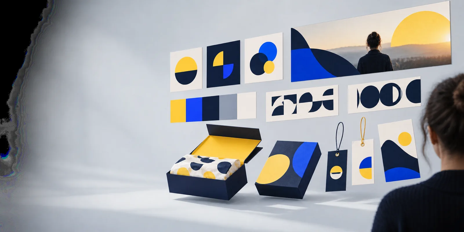
Logoai brand visual

The audience's existing pipeline

A useful concept fits into the work already happening around a brand: defining its audience, testing its message, and choosing where the mark will live.

Small-business founder

You have a business name and a rough idea of your customers, but no visual direction to discuss. Write down the feeling the business should convey before comparing logo concepts.

A shortlist of directions you can test on a sign, social profile, and invoice rather than choosing from isolated images. For a business-focused brief, see ai company logo.

ai company logo

Independent designer

You need to show a client distinct approaches without treating the first generated image as finished identity work. Keep the client’s name, audience, and constraints consistent across each exploration.

A more focused review: the client can compare concepts against the brief and explain what works. Use ai logo prompts ideas to vary one design decision at a time.

ai logo prompts ideas

Marketing lead

Your team needs a direction that can extend beyond a presentation slide. Compare how each candidate behaves beside headlines, product imagery, and a compact profile image.

Feedback about legibility and brand fit, not just personal taste. Best logo ai examples offers additional directions to examine before the team commits.

best logo ai examples
Where we slot in

Treat artificial intelligence logo design as concept exploration within a larger identity process. The right next step depends on what you already know about the brand.

1

You know the audience and brand position but have no visual direction.

Explore contrasting concepts from one consistent brief.

Changing the style while keeping the business context steady makes the differences easier to evaluate.

2

You already have a promising mark but it feels generic.

Identify the specific feature to revise, such as the symbol, lettering, or color relationship.

A targeted revision preserves what works and gives reviewers a clear reason for the change.

3

You need a final logo for public use.

Review the selected direction with a designer and check the terms governing any generated material.

A compelling concept alone does not establish originality, usage rights, or suitability for every application.

Before/after

These workflows turn an open-ended request into a reviewable design decision. Each starts with an input you can state plainly and ends with a check you can perform.

    • Brief

      From vague idea to usable brief

      Explore a brief

      Execution sequence

      1. Write one sentence about the business and its audience.
      2. Choose two or three traits the mark should communicate.
      3. Name one real place where the logo must remain readable.

      Before: “Make a modern tech logo” leaves the audience, tone, and application undefined. After: a brief names the business, describes who it serves, and sets constraints such as simple shapes and legibility at small sizes.

    • Compare

      From scattered concepts to a shortlist

      Explore directions

      Execution sequence

      1. Keep the brand description consistent.
      2. Separate symbol-led, wordmark-led, and combined directions.
      3. Record why each option does or does not fit the audience.

      Before: unrelated images make it difficult to tell whether the symbol, color, or overall style caused a reaction. After: compare a few directions against the same brief, changing one meaningful design variable at a time.

    • Review

      From favorite image to practical review

      Explore a concept

      Execution sequence

      1. Reduce the concept to the smallest likely display size.
      2. Check the spelling and appearance of any lettering.
      3. Review usage terms and possible conflicts before adoption.

      Before: a logo is judged only at presentation size. After: inspect it on light and dark backgrounds, as a small profile image, and next to the actual business name. Set aside concepts whose details disappear.

    Deliverable spec

    A concept becomes a useful handoff when another person can understand the intended mark, its constraints, and the decisions still open.

    Required

    The exact business name and any required tagline

    Check every letter manually; generated lettering may be inaccurate.

    Required

    A short description of the audience and the impression the logo should create

    Use this to evaluate fit instead of relying on personal preference alone.

    Required

    The smallest and most important intended uses

    Include contexts such as a profile image, storefront, packaging, or website header.

    Required

    A record of the selected concept and why it was chosen

    Note what should be retained, changed, or redrawn in the next iteration.

    Optional

    Preferred colors and a version that works without color

    A monochrome check can reveal whether the mark depends too heavily on effects.

    Optional

    A professional review of originality, rights, and final artwork

    Especially valuable before making the logo a lasting public brand asset.

    Take the next design step

    Start with a brief worth testing

    Describe the business, its audience, and one practical use for the mark. Explore a direction, then bring the strongest concept back to your brief for a careful review.

    • State the audience before the style
    • Compare directions against the same brief
    • Check details before public use

    Scenario FAQ

    Include the exact brand name, what the organization does, who it serves, and the impression the logo should make. Add practical constraints, such as where the mark will appear and whether it must work at a small size. These details give you a basis for judging concepts rather than selecting a favorite image on sight.

    A concept can help you discover a visual direction, but a finished identity has to work consistently across real applications. Check lettering, small-size clarity, color variations, and how the mark sits alongside other brand elements. A designer can refine the chosen direction and prepare artwork appropriate to its intended uses.

    Compare it with the traits in your brief and show it in the setting where your audience will encounter it. Ask reviewers what they think the business does and what impression the mark gives them, rather than asking only whether they like it. If their answers consistently miss the intended message, revisit the direction.

    Read the relevant tool terms and inspect the concept for inaccurate text or familiar-looking symbols. Consider a search for potentially similar marks and obtain qualified legal advice when ownership or trademark protection matters. Do not assume that generating an image gives you exclusive rights to it.

    Make a logo
    Make a logo