Symbol
A symbol may be a letterform, a geometric shape, an animal, or an abstract mark. Simple silhouettes tend to survive small-scale use better than fine lines or crowded illustrations.
Logo design basics
If you are asking what does an ai logo look like, picture a brand mark built from a symbol, a name, or both. The result might be a crisp wordmark, a simple geometric icon, or a more illustrative concept; no single style makes a logo AI-generated.
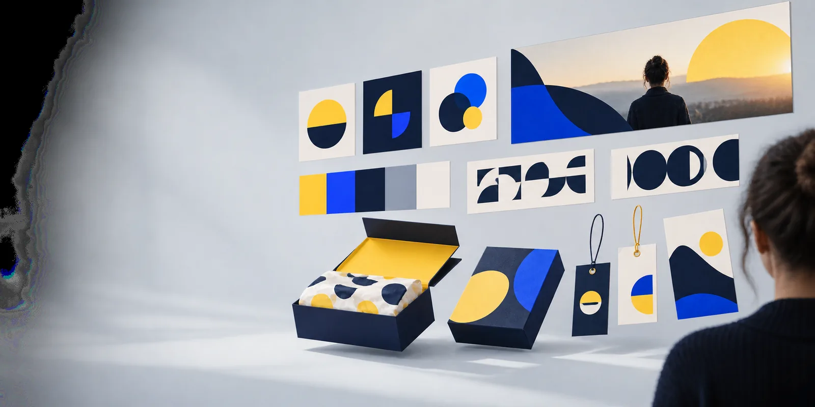
An AI logo is a proposed brand mark made with help from an image or design system; its appearance depends on the brief, not on a required visual formula.
The most useful way to recognize a logo is to inspect its parts rather than hunt for an obvious AI signature.
A symbol may be a letterform, a geometric shape, an animal, or an abstract mark. Simple silhouettes tend to survive small-scale use better than fine lines or crowded illustrations.
A wordmark makes the brand name central. Check each letter closely: attractive lettering can still hide uneven spacing, misspellings, or shapes that are hard to read.
Color sets a mood, but the mark should not rely on a gradient to make sense. A one-color version reveals whether its underlying shape is strong enough.
The path from an idea to a usable mark is a short cycle of direction, selection, and refinement—not a guarantee that the first image is finished.
Start with the name, audience, and a few visual preferences. “Calm botanical shop with a readable serif wordmark” gives more direction than “make a cool logo.”
Look for a distinct silhouette and lettering that suits the business. Set aside concepts whose meaning depends on tiny details or decorative effects.
View the leading concept on a small screen, a plain background, and in black and white. Revise the mark before treating it as a final identity.
A logo looks different when viewed as inspiration, as a written design brief, or as a mark a business intends to use.
Compare visual approaches to see which marks stay clear when their styling is stripped back.
Find ways to describe a symbol, lettering style, and mood before reviewing concepts.
Consider the practical checks that matter before placing a generated mark on business materials.
Choose the visual direction by where the mark must work, not by which concept looks most elaborate at full size.
1
Favor a wordmark or a restrained symbol-and-name lockup.
The lettering carries recognition even when the symbol is unfamiliar.
2
Favor a compact shape with a clear outline.
A simple icon has a better chance of remaining legible when reduced to a small square.
3
Use it as exploratory artwork, then simplify it for the core mark.
A detailed scene may look compelling at presentation size but lose its identity on packaging or a profile image.
Appearance alone cannot establish whether a logo is technically sound, distinctive, or ready for every use.
A polished concept can still resemble an existing brand. Visual appeal is not evidence that a mark is distinctive or available to use.
WorkaroundSearch for similar names and marks, and seek appropriate professional advice before relying on a logo commercially.
Small or stylized lettering may look convincing in a large preview while becoming unclear at normal viewing sizes.
WorkaroundInspect the name letter by letter and test the design at the size you will actually use.
A visual concept does not by itself establish that you have editable artwork or every version needed for print and digital use.
WorkaroundConfirm the available files and prepare suitable color, one-color, and small-size variants.
Founders exploring a first identity, teams comparing directions, and creators refreshing a personal mark can all use visual concepts to discuss what fits. Logoai can be a starting point for that exploration; review any result for clarity, distinctiveness, and the uses you have in mind.
It can look like a wordmark, a standalone icon, or a combination of the two. Some concepts are minimal and geometric; others are illustrative. There is no required robot, circuit, or futuristic effect.
No. Its style can reflect the brand being described, whether that calls for something traditional, playful, or understated. Judge the design by how clearly it represents that brand, not by whether it advertises the method used to create it.
Its main shape should still be recognizable, and any essential text should remain readable. If thin lines or tiny details disappear, try a simpler variant for small placements.
Not reliably. A human-designed mark can use the same colors, shapes, and typography as an AI-assisted concept. The visible design is a starting point for evaluation, not proof of how it was made.